Project Brief
This project started as something I proposed for a client when they started to bring on more designers to their growing team. It worked so well that we wanted to replicate it for internal use so that our design team could rapidly produce prototypes. I was tasked with creating and managing a reusable design system with responsive components.
Accessibility Challenges
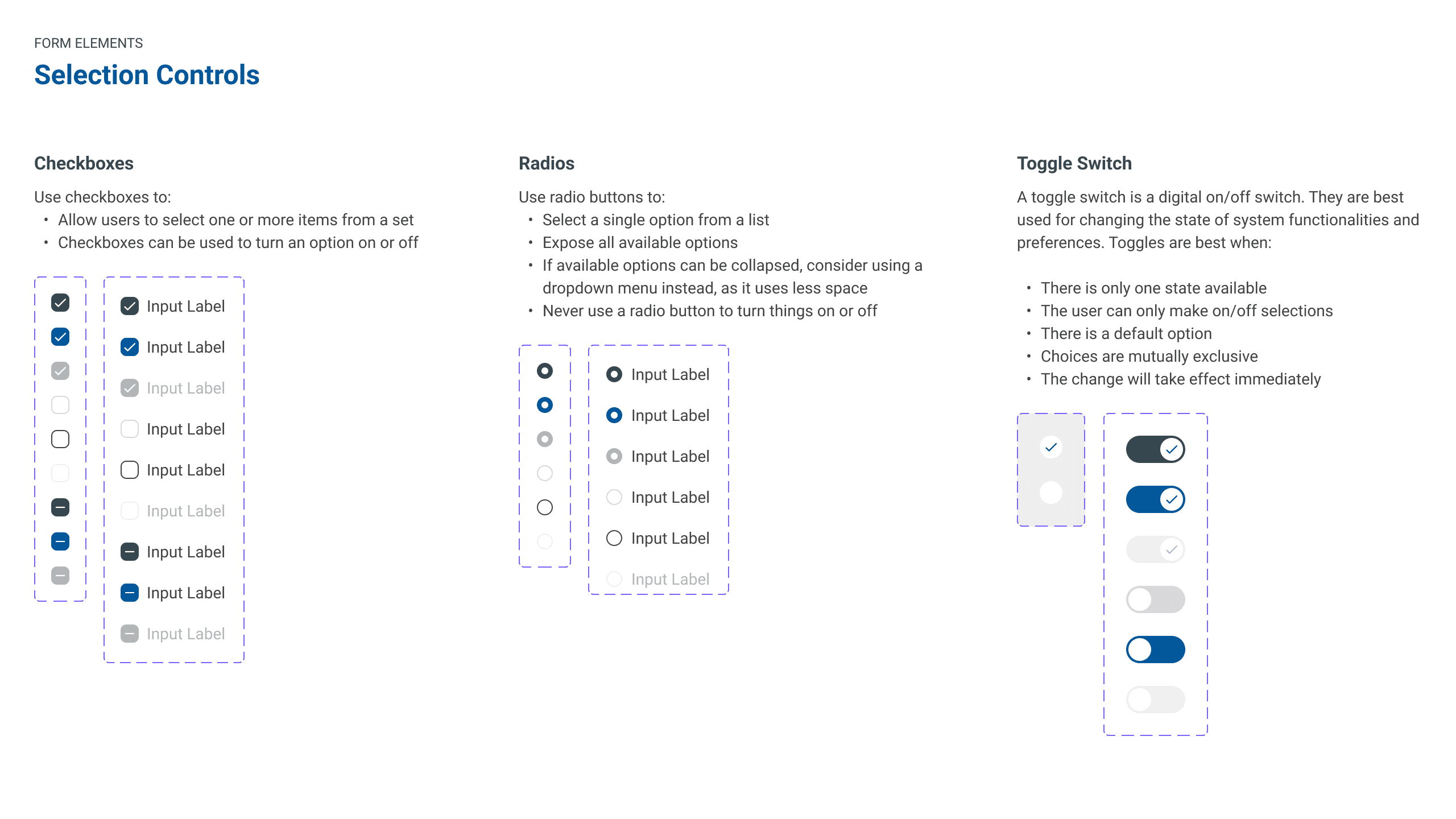
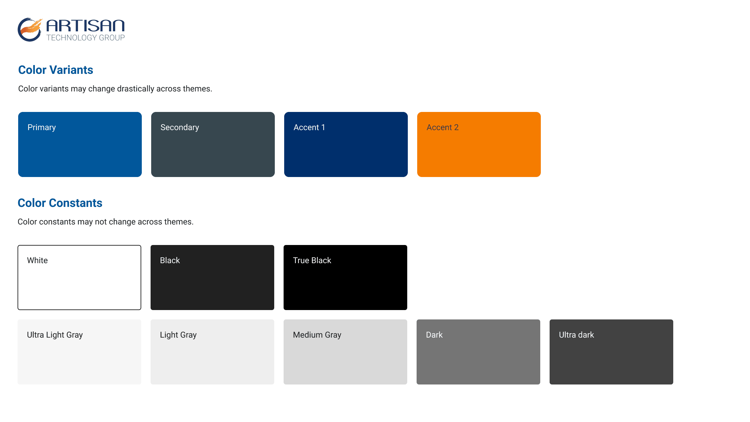
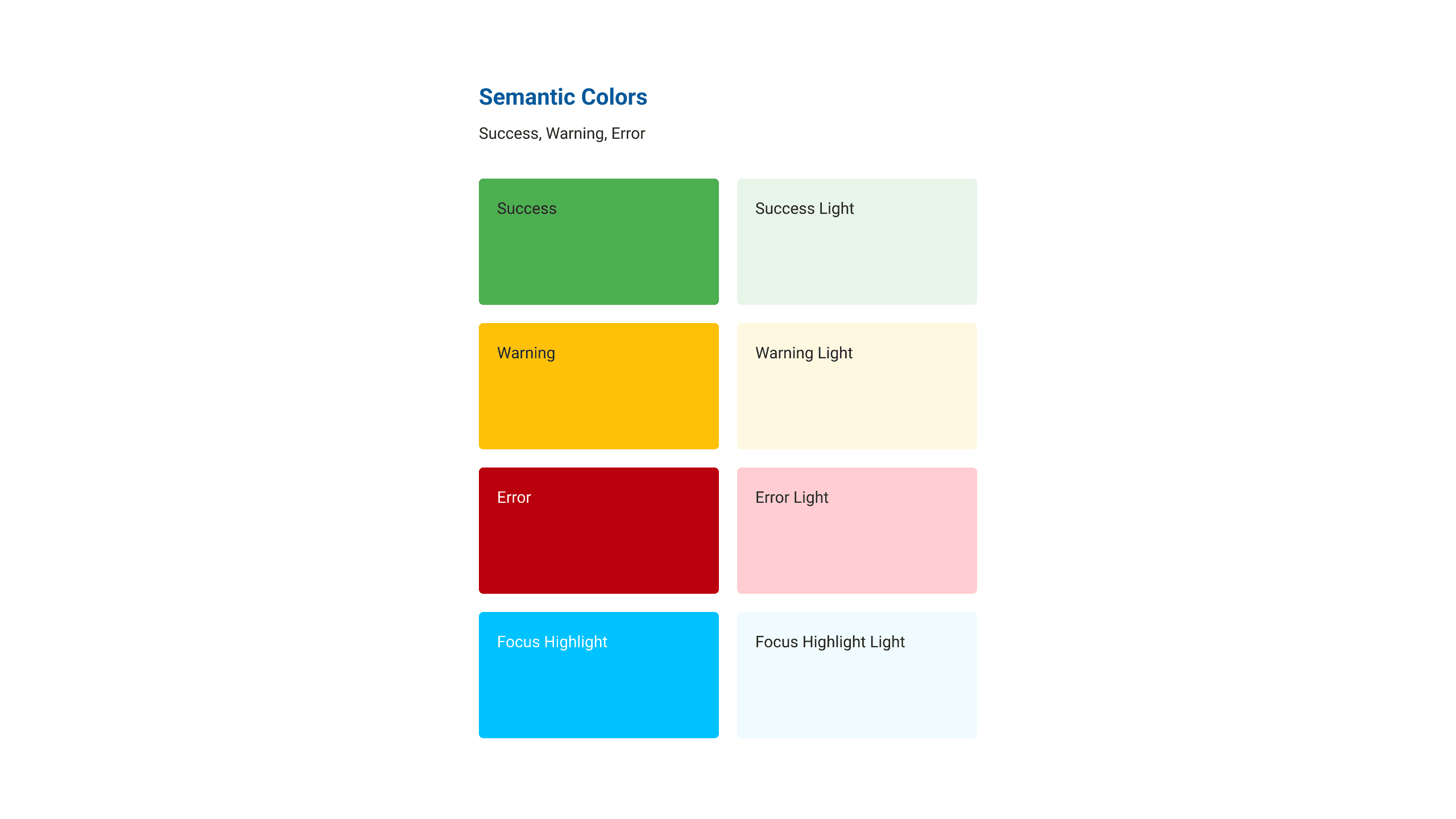
We serve a wide range of users and one of the things we wanted to make sure was that we were being as inclusive as possible. Any time we would theme an app with their company's colors we wanted to make sure everything was AA compliant by utilizing WebAIM's Contrast Checker. We found that buttons with white text had to have stronger weights of at least medium or bold when paired with certain background colors.
Prototype
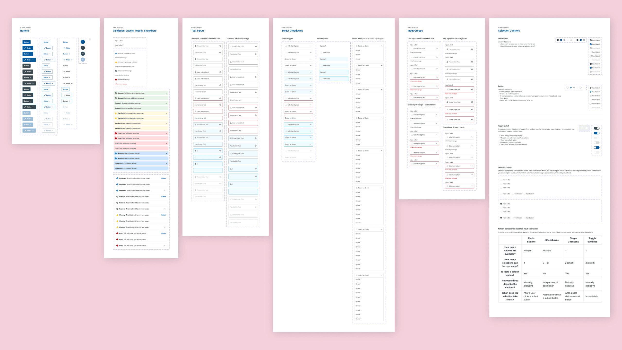
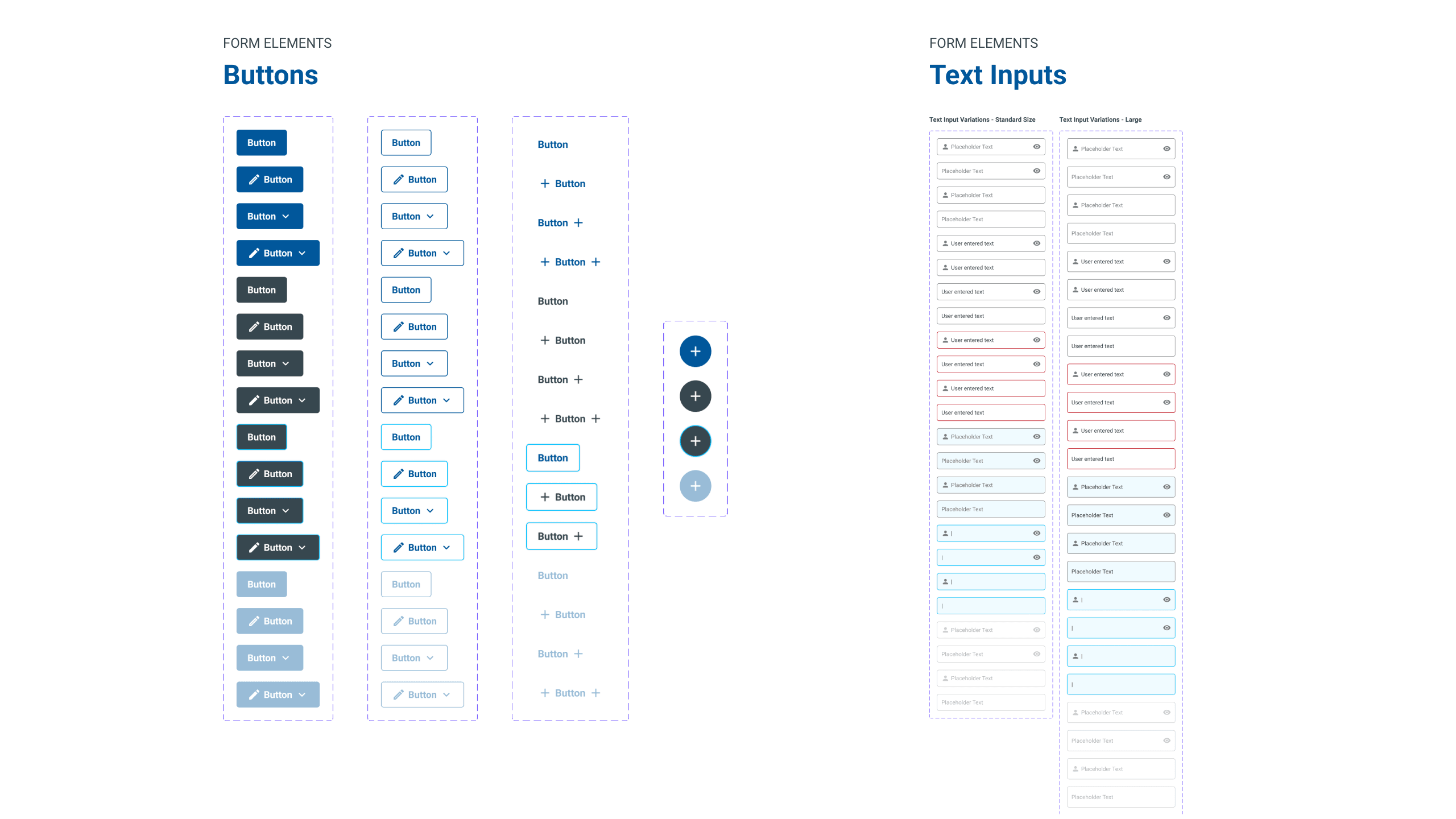
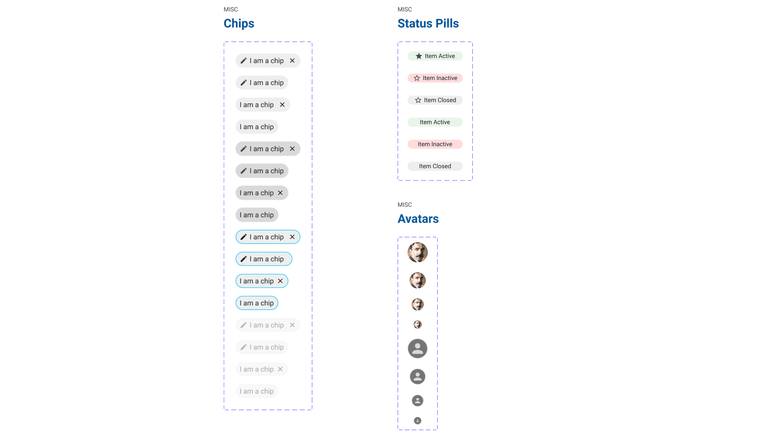
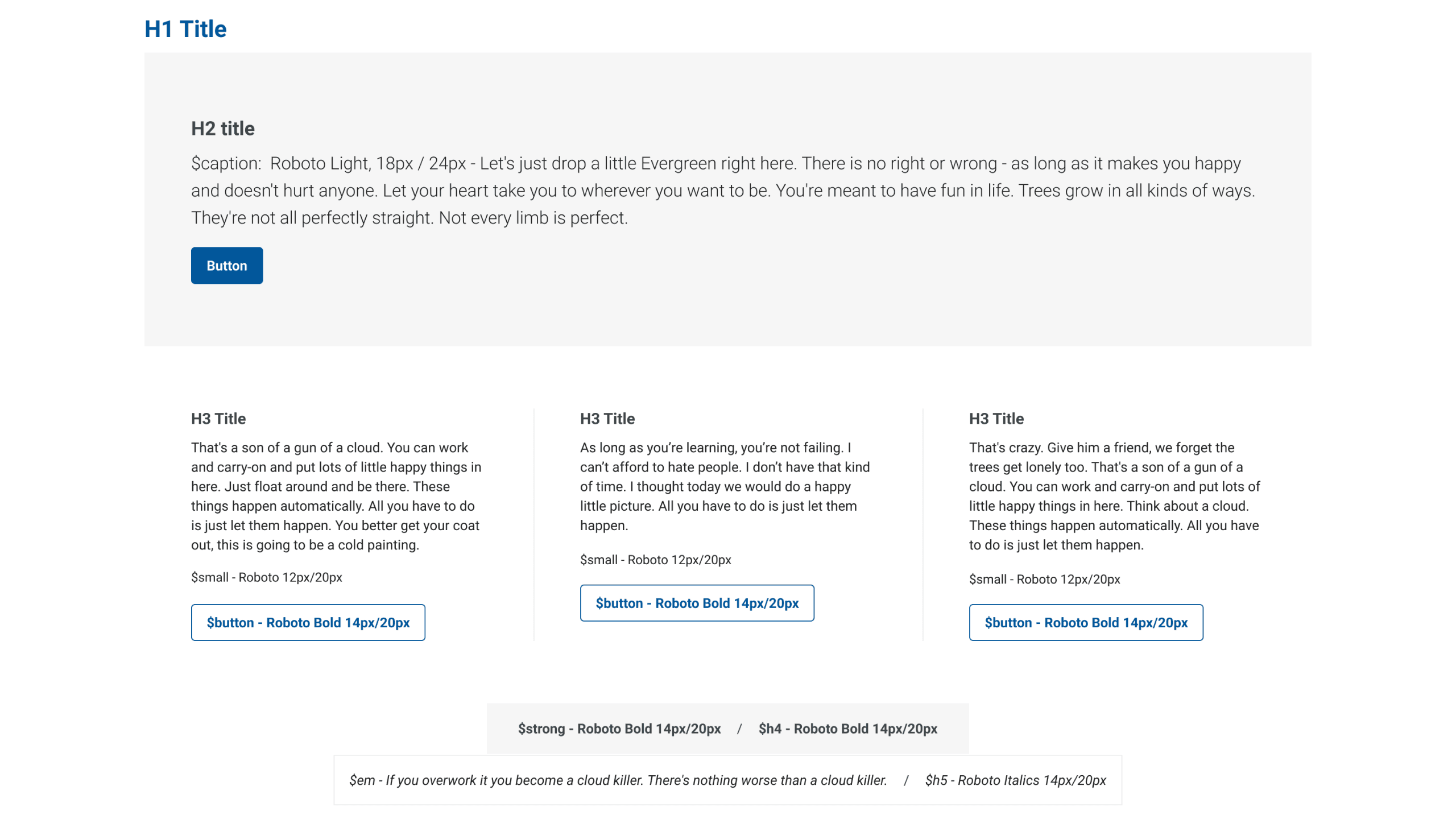
I created comprehensive color systems including color variants and semantic colors, along with a complete typography scale to ensure consistency across all design work.
Results
- A reusable design system for the design team to rapidly develop prototypes and handoff to engineers
- Accessible components that are AA compliant
- Scalable components that could easily be updated
Learnings
- Design systems take a lot of teamwork and input from fellow designers and engineers is important
- The system is continually evolving as your needs change and learn better ways to organize your document
- Themer was my most used Figma plugin. It allowed me to quickly set themes for clients and swap their brand colors in and out
- Never stop learning! Figma is such an amazing tool and I'm constantly learning ways to use it. Don't be afraid to experiment and learn from your mistakes